.png)
Widgets: Cloud Costs
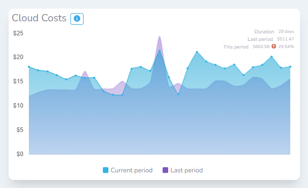
The ‘Cloud Costs’ widget provides you with an overview of your cloud expenditure over the last 30 days. The exact duration the graph shows can be seen in the top right of the graph. The graph is overlayed with data from the previous period to allow you to quickly see how your spending is changing over time.
With many cloud platforms, it takes a number of days for costs to ‘settle’. This means that the full amount spent on a given day may change. This is different for each cloud provider. The graph should be used as a visual indication and is not a guarantee of your current spend.
What does it show?
The widget is a line graph that displays the amount of money in dollars that has been spent. Clicking on the colour tile next to each data series will allow you to toggle the visibility of that period.